 2026
2026A/B Test Configuration Panel
Every change to a running A/B test at Polska Press required a full dev cycle. Extending a test, adding a site, pausing it – all through a developer, a ticket, a queue. Across 30 sites.
The expectation was to build a panel so Product Owners could handle it themselves. I designed it – and then made the case not to build it. Here's why.
My role
The only designer on the project. Worked directly with the dev team and Product Owners.
Research & problem framing
Measuring cycle times, mapping PO frustrations, building the business case.
Design & prototyping
Full flow: IA, user flows, UI, interactive prototype in Figma Make.
User testing & discovery
Six 1:1 sessions. Each round surfaced something the team hadn't seen before.
Cross-team collaboration
Daily contact with the architect lead and the existing panel design team.
Understanding the problem
Was it worth building a panel to give Product Owners direct control? No one could answer without a design first. I started by measuring how bad the current process actually was:
Extending a running A/B test to additional sites
3 days 3 h
Re-running an existing A/B test on a new set of sites
4 days
Restarting a previously stopped A/B test
1 h 47 min
Reassigning an A/B test to a different site
1 h 10 min
Disabling an active A/B test
52 min
52 min
fastest operation in the process
4 days
slowest operation in the process
Designing for scale
A/B tests were just one thing POs needed to configure without a ticket. I mapped the full scope and designed the whole panel.
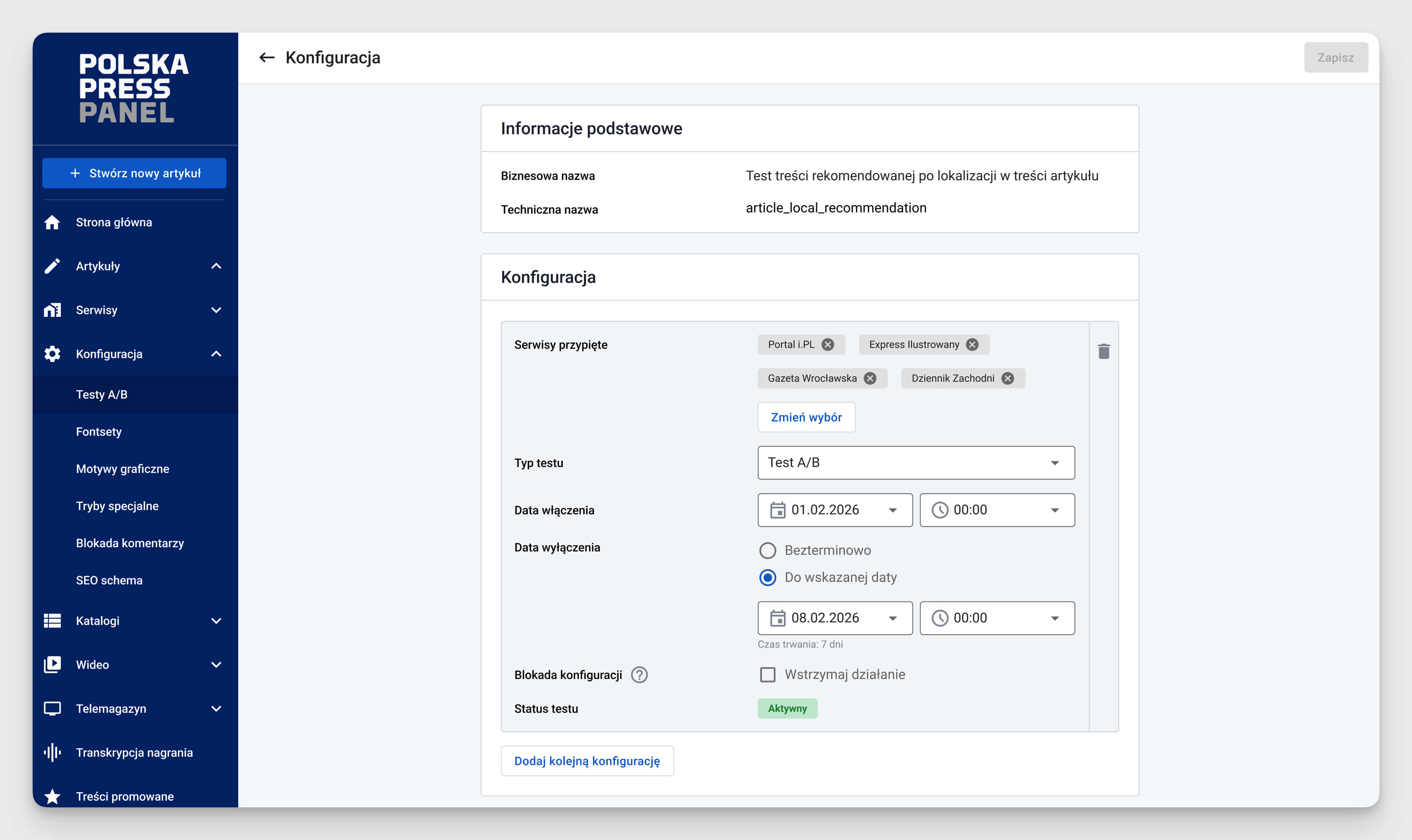
Every section follows the same pattern: list, open one, fill in the form, assign sites, save. A PO who learns how to set up a test already knows how to configure a font set.
Key design challenges
Every screen I showed unlocked questions nobody had asked before. Things that seemed obvious turned out to be anything but.
Group settings could silently overwrite site exceptions
Nobody had considered this. Took three attempts to find a solution that actually worked.
Assigning sites turned into conflict management
Some sites already had an active A/B test. I had to show that inline while picking sites, not after hitting save.
A simple form had to work for six different feature types
Technical constraints meant one universal pattern for everything. I designed it to work across all feature types without exceptions.
Validating with Product Owners
Six 1:1 sessions with Product Owners
Figma Make prototype with real data. Much better feedback than static screens.
Continuous iteration between sessions
Changes after every round. Daily conversations with the team shaped what got tested next.
Pitch to IT leadership with the full team
Design, plan, and technical approach all reviewed. Resulted in a key change: one site selection model across the whole panel.
Outcome
By designing the full solution, I gave the team what they needed to make a real call. That knowledge led to a clear decision: not worth building. And that's a win.
What the design process also surfaced: a shared overview of active tests and clearer handoff with devs resolved most of the frustration. Built in days, adopted immediately.
Designing it first
5 days
of design work
~100k PLN
saved
Building it straight away
3 months
of dev work
~100k PLN
spent
Lessons learned
Stated need ≠ real need.
People ask for a solution, not a diagnosis. The job is to find what actually hurts, not to build what they asked for.
Design as a decision tool.
The value here wasn't the prototype. It was the knowledge it surfaced before anyone wrote a line of code.
Technical constraints are part of the design.
Every UX decision was a negotiation with what the system could actually do. Ignoring that isn't creativity – it's just making work for developers.
Thanks for reading.