 2026
2026From Idea to Public Launch
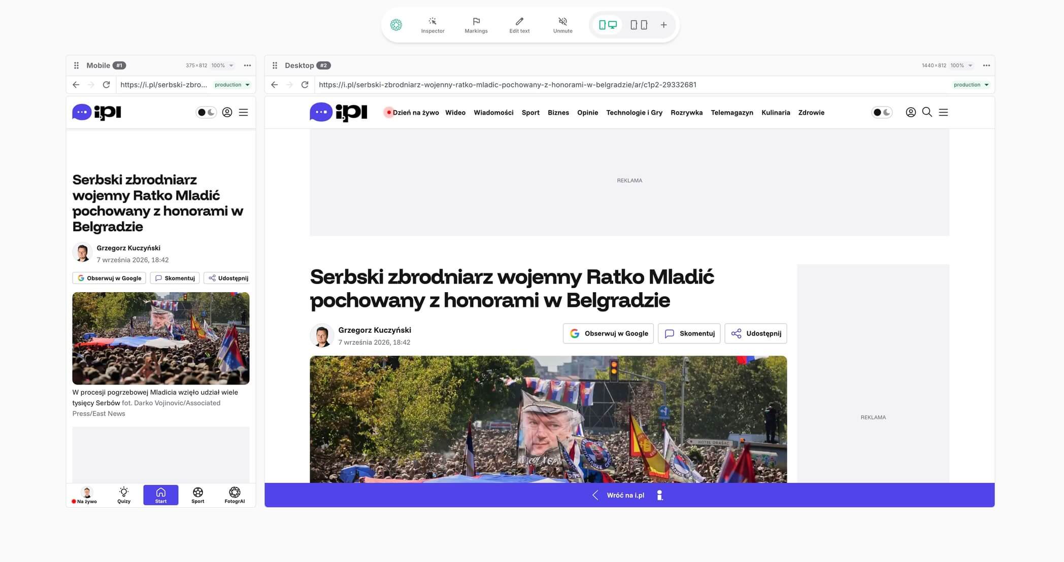
It all started at Polska Press. I noticed sprint reviews focused mostly on desktop screens, even though most of our traffic was mobile. We kept missing those layout blind spots. So, I designed and built an internal Chrome extension for side-by-side reviews, which smoothed out our workflow.
Seeing its potential, I spun it out into a standalone tool. Today, Dual Preview is used in over 40 countries.
My role
I owned all of it: research, design, code, launch, growth.
UX research & discovery
20+ qualitative interviews. Shaped the entire feature set.
Chrome extension
Full UI, UX, and logic – designed and built from scratch.
Landing page
Designed and built from scratch.
Growth & outreach
Zero-budget: Reddit, direct outreach, word of mouth.
Understanding the problem
I did research and realized sprint reviews were just the tip of the iceberg. When I deep-dived into team workflows, I uncovered additional friction points:
Daily Inspection
Complex devtools and company VPN blocks stopped non-technical staff from testing mobile views, pushing critical layout bugs straight into production.
UX Benchmarking
Designers manually captured phone screenshots, emailed them to laptops, and processed files for decks, wasting hours on manual file shuffling.
Token & Analytics
Verifying UI color tokens and tracking events alongside layouts was overly complex, leading teams to skip checks and break data tracking.
50%
Of sprint reviews skipped mobile entirely
80%
Of teammates struggled to check mobile layouts daily
3h+
Wasted per week gathering mobile screenshots for decks
~30%
Of minor mobile bugs reached production unchecked
That became my design challenge. How could I bridge the mobile-desktop divide instead of letting old habits dictate our workflows?
From concept to execution
I brought the problem directly to the Product Owner and IT leadership, laid out the case for fixing it, and got the green light to build a solution.
Building the solution
I started by going back through recordings of old sprint reviews and meetings to see how the team actually worked. Then I talked to people across the team. The pattern was clear: any solution that added steps would just create new friction on top of the old one.
I designed the initial concepts in Figma and worked closely with a developer, testing and iterating. Our rule: one click, both views immediately. No configuration, no learning curve. Because the moment someone has to stop and think about the tool, it's already failed.
Validating ideas
Almost every feature started with early internal tests. I invited team members to try out early builds and quickly noticed a major hardware split: people were working on completely different setups, some on massive monitors, others on small laptop screens.
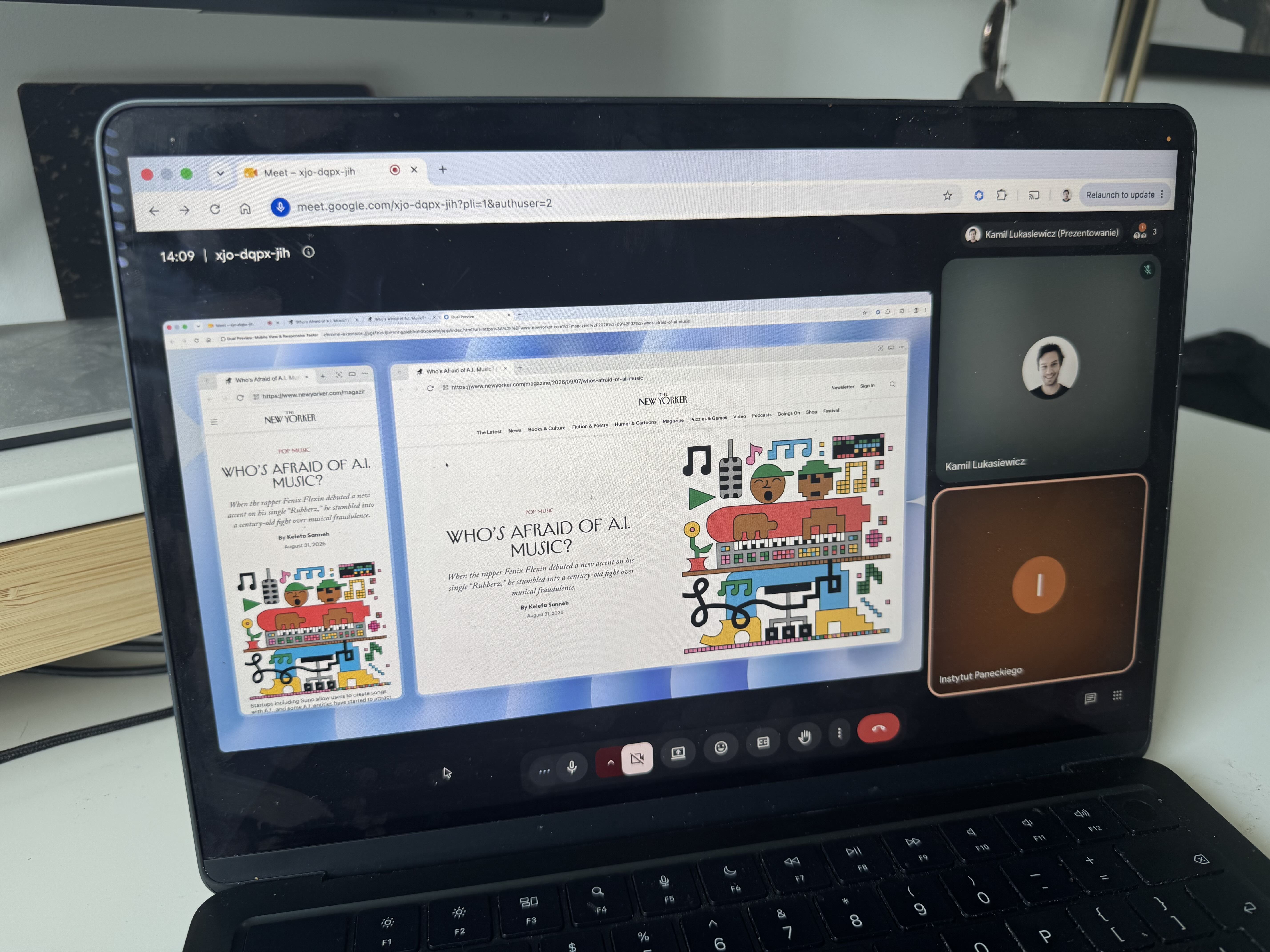
This made screen-sharing during sprint reviews messy. I had to adjust how the extension scaled so that no matter what screen size someone shared, the side-by-side view stayed crisp and easy for everyone to read.
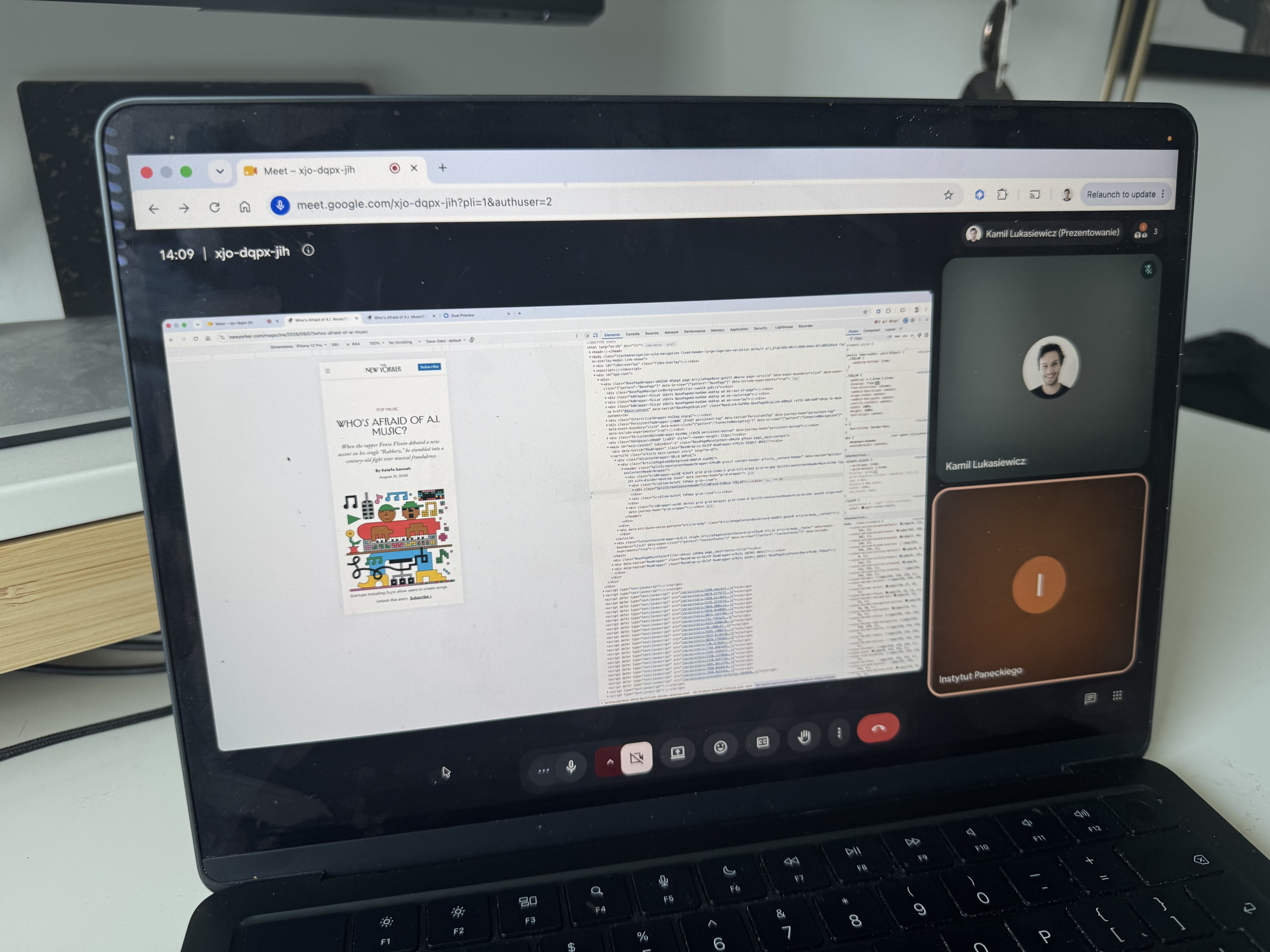
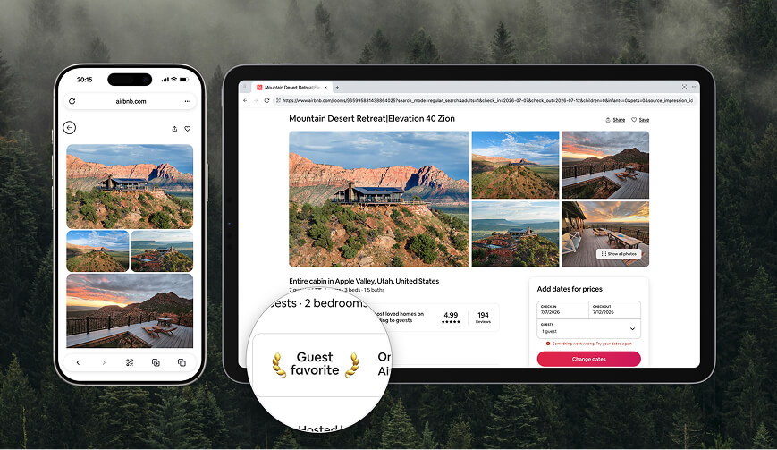
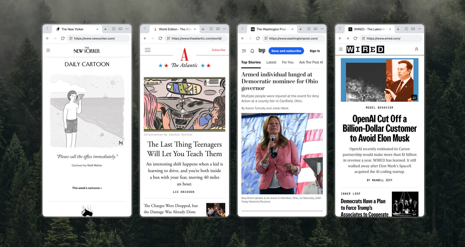
The extension had to work on all of these.
Internal impact
Both IT and Marketing adopted it without any mandate. It just became the default: no onboarding, no push, no training.
The best part: it marketed itself. People saw it on someone else's screen during a call and immediately asked how they could get it too.
67% 🎉
team adoption rate
~30% ✨
fewer mobile bugs in production
Going public
After seeing how well it worked internally, I decided to take the core idea public. I built the public version from scratch, completely separate from Polska Press infrastructure and codebase. They knew about it and cheered it on.
It was also a deliberate experiment: could I build a real product alone and keep it from looking generic? I redesigned the UI to match Chrome's aesthetic and checked every output. Beating AI slop became its own design discipline.
Scope of work
Chrome Extension
Designed and built the public version from scratch: UI, UX, logic, and Chrome Web Store listing.
User Research & Interviews
Shaped the feature set through conversations with product teams, sales reps, and digital agencies to understand their presentation challenges.
Landing Page
Designed and built from scratch.
Onboarding & Offboarding Flow
Handled the user journey from Chrome Web Store installation and the first-launch pin prompt to post-use reviews and uninstall feedback surveys.
Analytics
Integrated PostHog to track usage metrics and user engagement.
Organic Growth & Outreach
Zero-budget promotion across communities like Reddit and direct outreach to alternative tool users.
Customer Discovery
Through 20+ qualitative interviews with product teams, sales reps, and agency workers, I dug into how they managed past presentations and where workflows broke down.
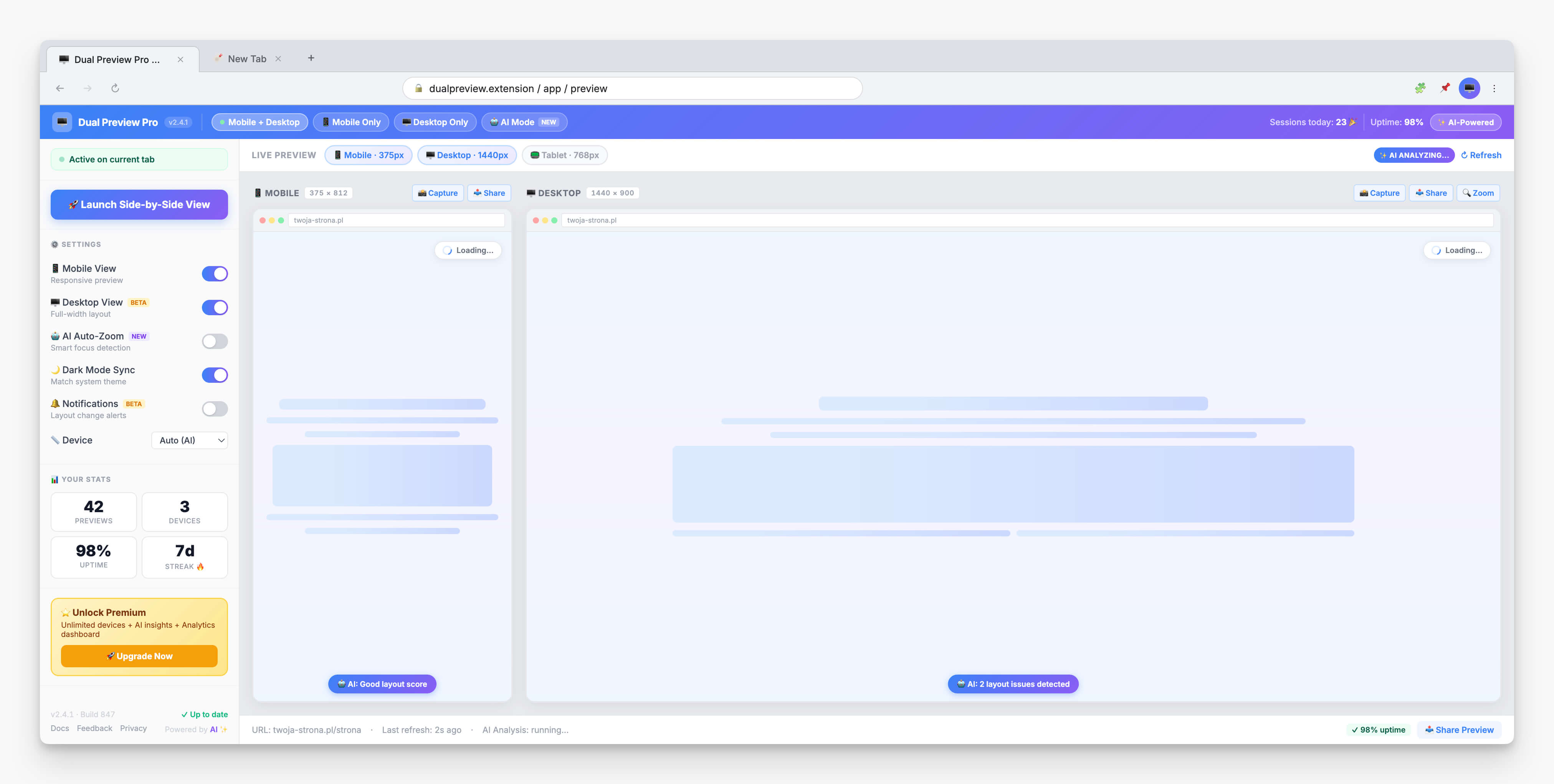
These sessions revealed that a simple side-by-side view solved 90% of needs, so I designed an ultra-minimal UI keeping advanced tools one layer deeper:
Immersive Mode
Browser chrome distracted non-technical clients. Built to remove the clutter.
Zoom Feature
Highlighting micro-interactions during remote calls was hard. Built to direct attention precisely.
Custom Branding
Agencies needed logos during live demos. Added it.
Lessons learned
Beating AI Slop
Early builds looked generic. I regained control by breaking development into micro-tasks.
Never Skip Git
Starting without GitHub forced a total restart after irreversible code changes.
Reliable Foundations
Leaning on shadcn/ui and Lucide Icons bypassed reinventing basic UI components.
The Real Challenge
Writing code was easy; the hard part was figuring out true user needs and effectively communicating that value to the world.
Results
The best part wasn't the numbers. It was realizing how fast I can ship and watching others rely on it every day.
400+
Installs in under two months, $0 marketing budget
28%
Landing page conversion rate
42%
Users returning on subsequent days
41
Countries across 6 continents
Warm praise across the design community with flawless 5/5 reviews. Organic traction driven entirely by word-of-mouth: zero emails, ads, or push notifications.
Reviews
Useful tool, lets me quickly check if my mobile UI didn't explode during rapid development :)
yhooo this is crazy man y'all have to check this out wow i love it less stress of switching and adjusting viewport . great stuff
I didn't realize how much I needed this plugin until I tried it! It's fantastic - highly recommended for UX/UI designers 🤩
I don't usually write reviews, but this extension deserves one. I installed it expecting a simple responsive preview tool, and it ended up becoming part of my daily workflow.
It's intuitive, reliable, and saves me from repeatedly opening DevTools or reaching for another device just to check a layout. Small tool, but a real productivity boost.
Simple, seamless and useful! It's great and will make my work so much easier!
Thanks for reading.