 2019
2019How I Joined Mid-Project and Redirected Gratka's Mobile App
My role
Head of Mobile
Polska Press Group
What I owned
Context
Gratka.pl is a Polish classifieds platform, part of Polska Press Group. I joined to work on other products, but watched the Gratka mobile team from the side.
I put my observations into a pitch and presented it to leadership. They moved me onto the Gratka team.
I didn't start the project. I joined halfway through.
Comparison
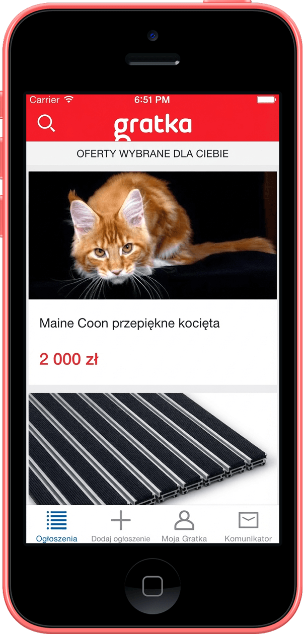
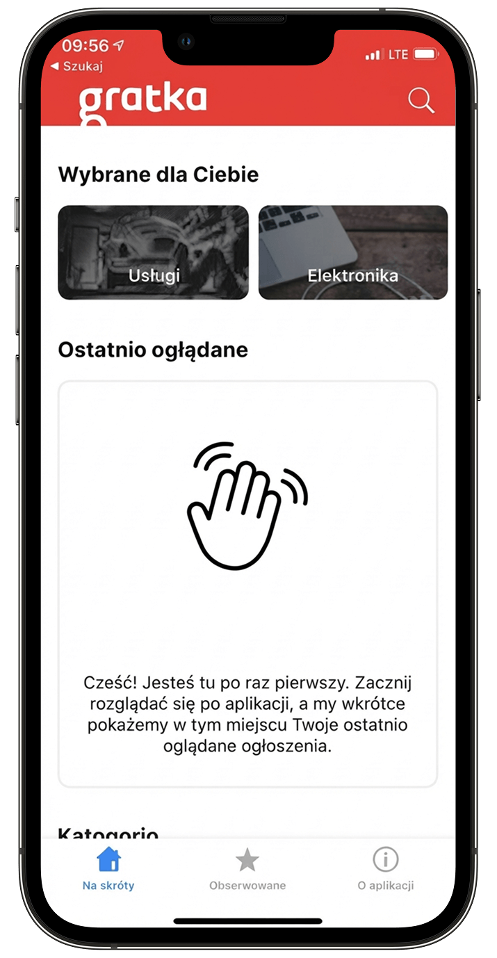
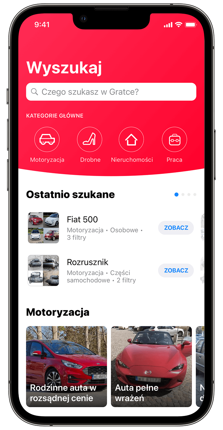
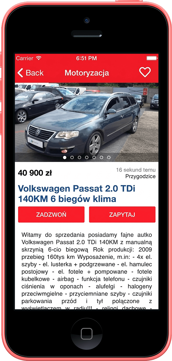
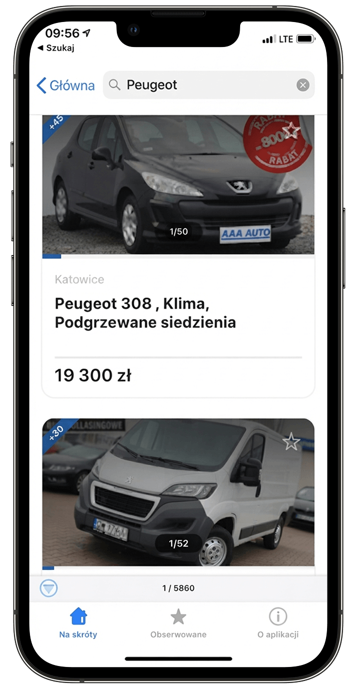
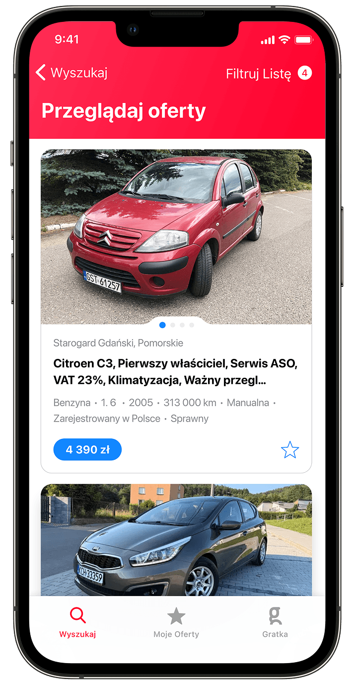
I arrived mid-project. This is what existed, what the team was building to replace it, and the direction I took instead.
Back to basics
The first question I asked was: what is this product actually for?
I ran research sessions with existing app users - people looking for flats, cars, everyday items. The pattern was simple: open the app, browse, either contact the seller or leave. The whole product came down to that one moment of connection.
Gratka should be like Nokia: connecting people. But that connection wasn't the focus of what was being built.
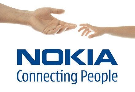
I kept coming back to this image with the team throughout the project.
That contact moment became our metric: of everyone who views an ad, how many reach out? The number was low, and the existing direction wasn't built around changing it.
The pivot
A team had spent six months building something. I came in and said we needed a different direction. That's easy to mishandle.
One thing helped: I'd been at Polska Press long enough on other projects that people knew how I worked. That trust mattered.
I never framed anyone's work as wrong. I proposed targeted changes: different navigation, a reworked listing page, one clear contact action. The backend stayed. We weren't just making it look better - we were making it serve a goal. Leadership saw the six months weren't wasted. The team had something concrete to react to.
One tap to contact
The design question: why don't people contact sellers?
Awkward cold start
What do you even write? A blank compose field is a micro-decision most people would rather skip.
Price feels off-limits
Asking to negotiate feels presumptuous. You don't know the seller, and leading with price is uncomfortable.
Too much context needed
You have to explain which listing you're asking about. More text, more effort, more reasons to bail.
Typing on mobile is effort
Even a short message takes friction on a phone. Anything that requires thought gets abandoned.
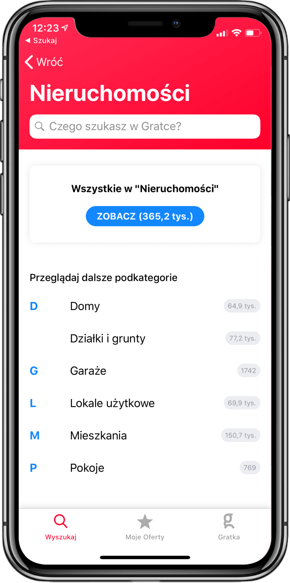
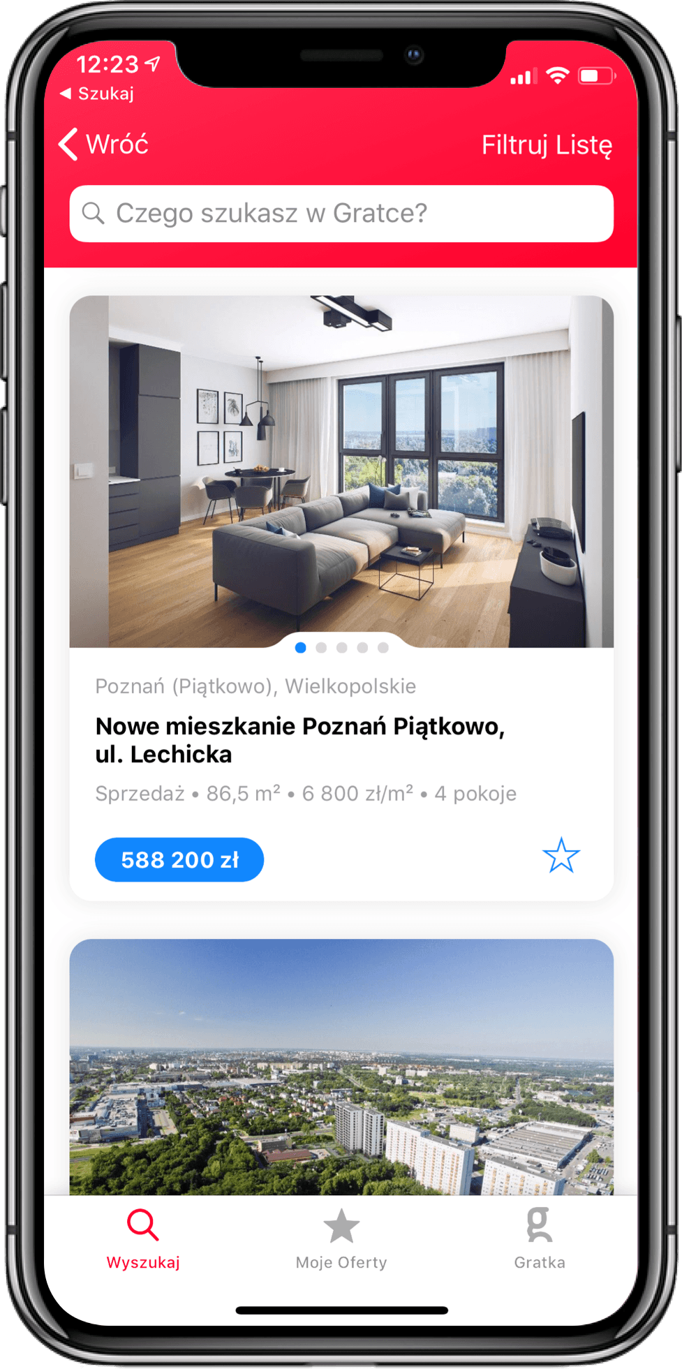
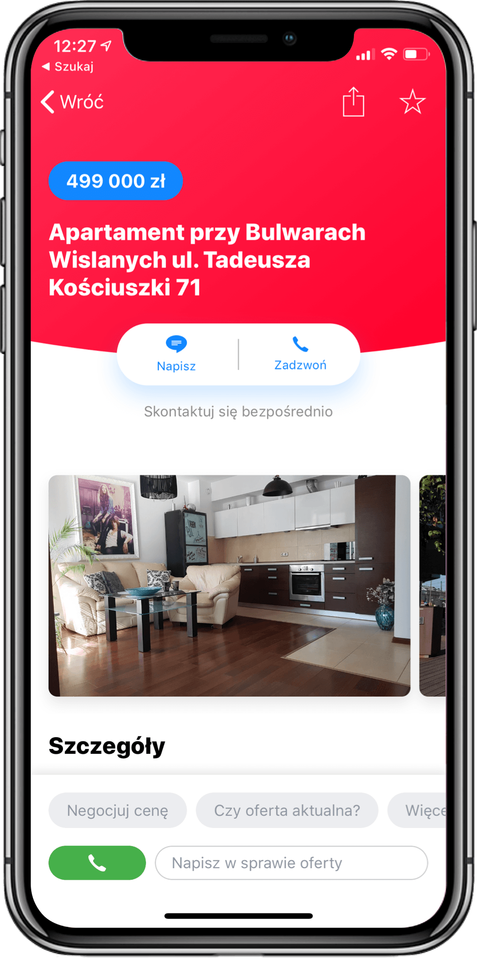
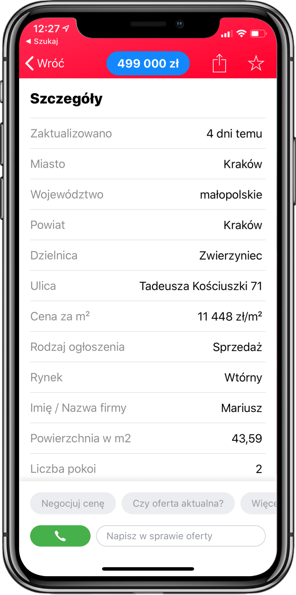
The answer: predefined messages. The listing screen showed one-tap buttons: ask for more photos, negotiate the price, check if still active. Each sent a message with the listing already referenced. No typing required.
One tap. No other Polish classifieds app had this at the time.
Results
We tracked one number as our north star: how many people who viewed a listing went on to contact the seller.
16%
contact conversion rate - double the web
28%
uninstall rate, old app vs new
4.2 / 4.5
App Store / Google Play rating after launch
At launch, the app was converting at double the rate of Gratka's website. The web team started asking how to match it. We started asking how to stay ahead.
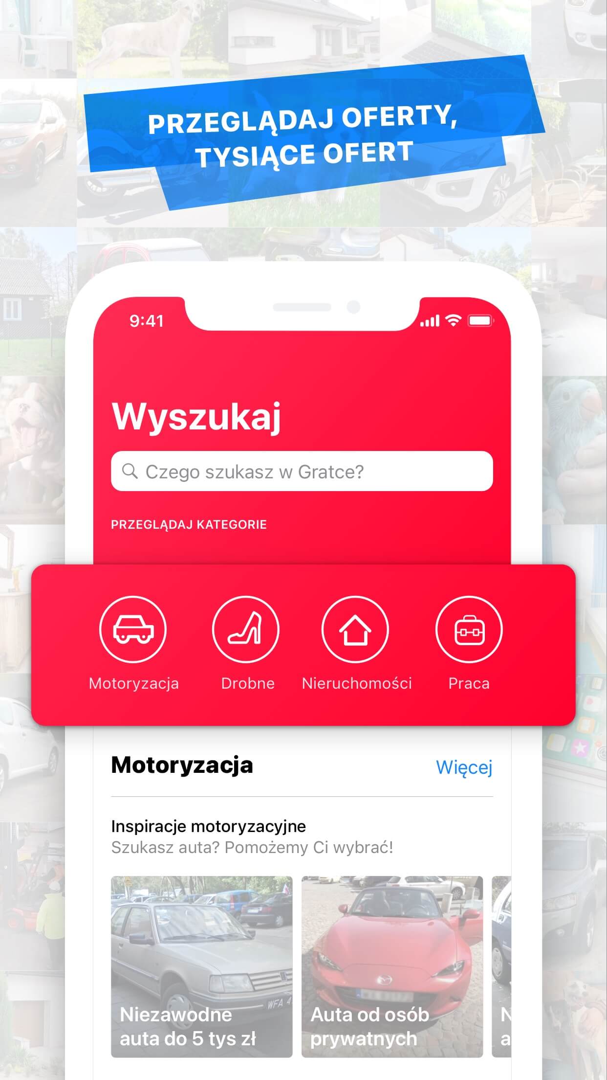
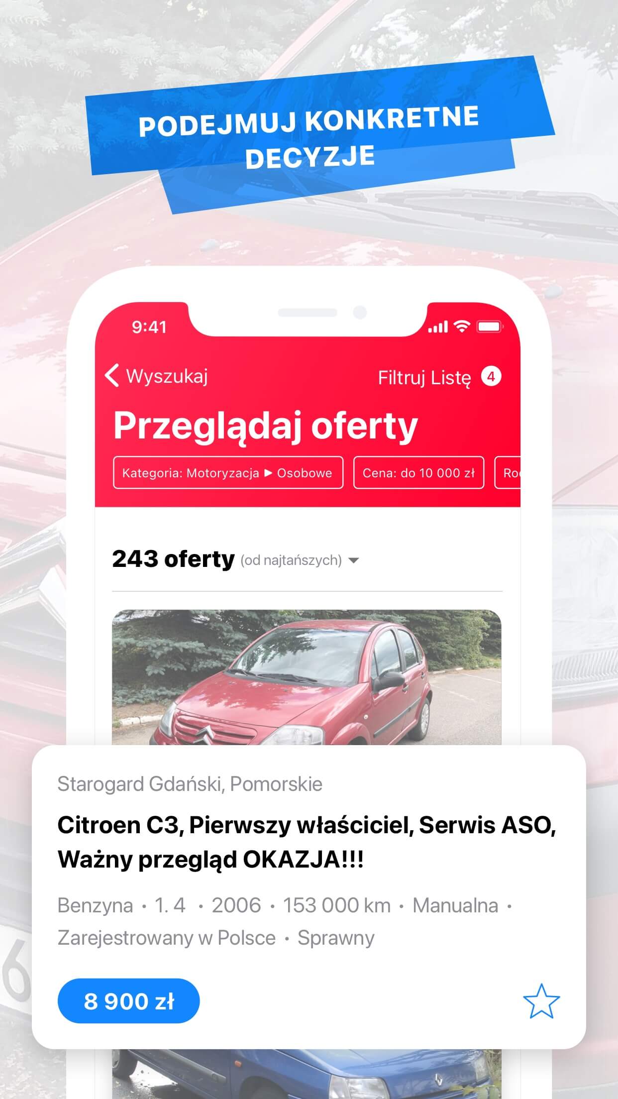
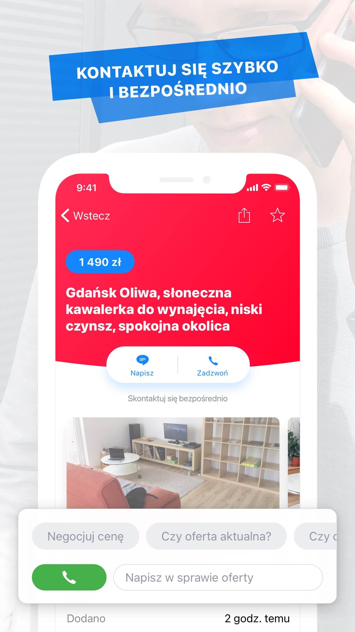
App Store screenshots submitted with the 2.0 release.
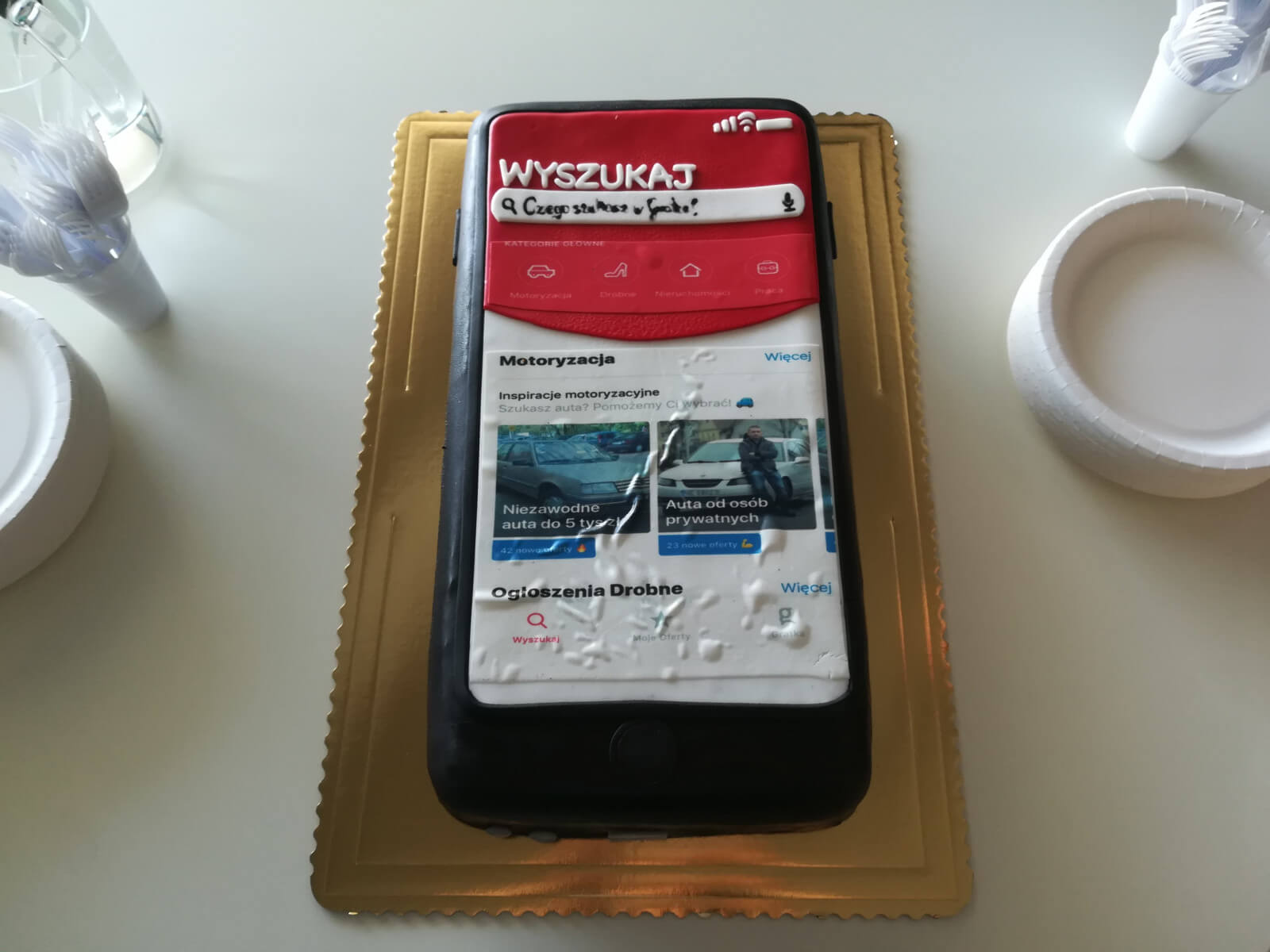
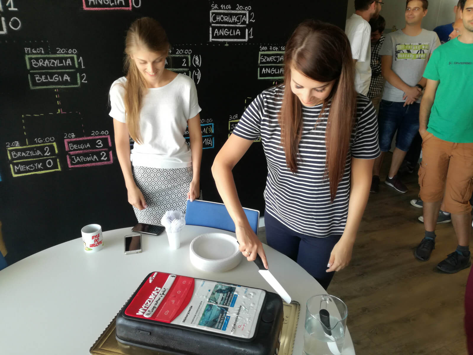
Launch day.
Prove first
We launched small. First prove the conversion improvement, then push downloads.
A concern came up: would the app cannibalize web traffic? My view: if mobile converts better than the mobile web, that's the product doing its job.
Once we had the number, we had a real case for growth.
Takeaways
Name the one metric the product is built around.
For Gratka it was view-to-contact conversion. Everything else - design, copy, interaction model - served that number.
Know exactly who you're designing for.
We weren't designing for all Gratka users. We were designing for someone on a bus with three minutes. That drove every decision, including what not to build.
Friction before the first message kills conversion.
The barrier isn't technical, it's social. Removing the awkwardness of starting a conversation was the biggest change we made.
Evolution, not revolution.
When proposing change, preserve what you can. It's faster, cheaper, and existing work usually has value a full rewrite loses.
Thanks for reading 👊